Hue Circle
It seems to be such an obvious arrangement.
The history of the hue circle should remind us that everything appearing obvious to us needed to be discovered or conceived. Neither the ancient Greeks nor the medieval scholars arranged the hues in a circle. Its history starts in the Renaissance. The following text is a very brief outline. Interested readers will find references for further reading.
Robert Fludd, an English physician and mystic is credited as the first creator of a printed color circle ($bibref('Kuehni', 2003), p. 37). A publication from 1629 shows a circle containing the names of 7 colors. At the bottom is black, followed in clockwise direction by blue, green, red, orange (croceus), yellow, and white. It's a circular arrangement of colors sorted by lightness but it's not a hue circle.
Isaac Newton discovered that a prism decomposes white light into the colors of the visible spectrum. In Opticks
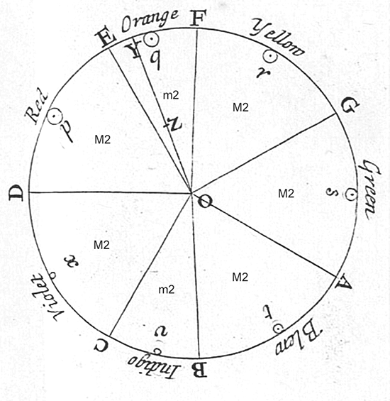
(1704) he arranged the linear scale of hues into a circle. Figure 11 shows a circle labeled with the names of 7 hues. I found the image below in the Internet and this is very similar to the reproduction of the figure in $bibref('Spillmann', 2009), p. 17. In the book by Kuehni (p. 44), however, the reproduction of the same figure is rotated by 180°: green is on the left side instead of the right side.

Newton was intrigued by the concept of parallels between musical harmony and color harmony. In his figure he labeled 7 radii that mark the transition between the hues with the letters A-F (with D, the line between red and purple, being opposite of green). The radii divide the circle in seven segments according to the intervals between the notes of the octave.
Books printed so far showed illustrations of the conceived arrangement of colors, respectively, but no colors themselves. Moses Harris produced the first printed hue circle in 1766 on colored copperplates. Actually, he designed two, one called prismatic
said to be containing the hues shown by a prism. He believed that red, yellow and blue were the colors most different from each other and should be placed separated by 120 degrees on the circle. It's a beautiful illustration indeed and covers the book by Spillmann. The second circle is called Compound
and contains all other colors in nature, not found in the prismatic part
(quoted according to $bibref('Kuehni', 2003), p. 56).
Since I'm German, there is no way around Goethe when writing about color. In his Farbenlehre
(1810) he presented a color circle comprising 3 pairs of opponent colors: purple - yellow, red - green, and orange - blue. The color pairs were observed in after images. Looking at an intense orange stimulus, for example, causes a blue sensation after the stimulus is removed. Nimmt man ein sehr lebhaft orange gefärbtes Stückchen Papier vor die weiße Fläche, [...]. Nimmt man aber das orange Papier weg und erscheint an dessen Platz das blaue Scheinbild [...]
(quoted from here).
The German painter Otto Runge and acquaintance of Goethe published a treatise about the relationship of colors in the same year as the Farbenlehre
was released. He presented the colors arranged in a sphere. The poles are black and white and the equator is formed by the hues. The colors lie on the circumsphere of a 6-point star formed by the equilateral triangles blue-red-yellow and purple-orange-green ($bibref('Kuehni', 2003), pp. 60-61) explaining color mixtures.
Runge's system is the projection of the HSL double-cone into a spherical form. It thus avoids having black and white as singularities. A description of the mathematical transformation of an RGB cube into a Runge sphere can be found in $bibref('Restrepo', 2011).
While the central axis of his color sphere represents a gray scale, Runge did not solve the issue that the full colors on the equator do not have the same lightness. Therefore the value of the central axis remains undefined.
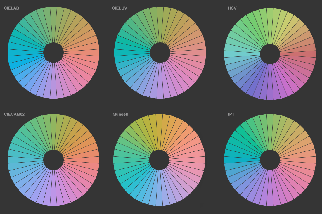
The lightness mismatch can be seen in the figure on the left showing the hue circle in the HSV model. The segments differ greatly in lightness and chroma. Compare, for instance, the red with the opposite cyan color. In a continuous hue gradient generated by the HSV model, bands appear at the equal mixtures of two primary colors, i.e. at cyan, yellow, and most pronounced, magenta.
When the US painter Albert H. Munsell started to work on his color system in the 1880's, he also tried to define a color sphere. Again, white and black are the poles and the axis between these points is called Value
. The numerical values range from 0 to 10. On the equator, he identified principal 5 hues: red (R), yellow (Y), green (G), blue (B), and purple (P). He added 5 halfway points as their mixtures: YR, GY, BG, PB, and RP. Each of the hues is further divided into ten degrees. Hue
is thus identified by initials like R or YR or by finer distinctions. 2.5R, for example, is a red inclining toward red purple; 7.5R is a red inclining toward yellow-red; 5R and R denote the same position in the hue circle. Chroma
is defined as the difference from greyness.
The value and chroma scales are designed to have equal visual increments. The perceived lightness difference between value 4 and 5 is equivalent to the lightness difference between value 7 and 8, for example. Similar, an increase of chroma by 1 is perceived as equivalent regardless of the initial chroma value and regardless of the hue angle.
Already in 1900, Munsell realized that a perceptually uniform color solid could not fit a sphere ($bibref('Kuehni', 2003), p. 84) because hues differ in their maximum chroma and reach their maximum chroma at different levels of value. He conceived the color tree
with the trunk being the value axis and branches in different lengths representing the different hues. Munsell thus moved away from the tradition of previous color order systems to place the most intense colors of each hue in the same central plane. Finally, the representation of appearance ruled over the desire to have a symmetric solid. As a consequence, no maximum is set for the chroma scale.
In the lower figure on the left you can see the Munsell hue circle for a few selected combinations of value and chroma. I used only those combinations where the complete hue circle is defined and within the sRGB gamut. You can either see the 10 named hues (these are those with a leading 5) or 40 hues (2.5, 5, 7.5, and 10). The figure is based on data from the so called Munsell Re-notations published on the RIT website.
Note that in the original description of the Munsell system the hues rotate from red to green and further to blue in clockwise direction. The orientation in the figure is reversed to align it with the HSV model and color appearance models like CIELAB.
The hue circle in four different color appearance models can be viewed on this page.
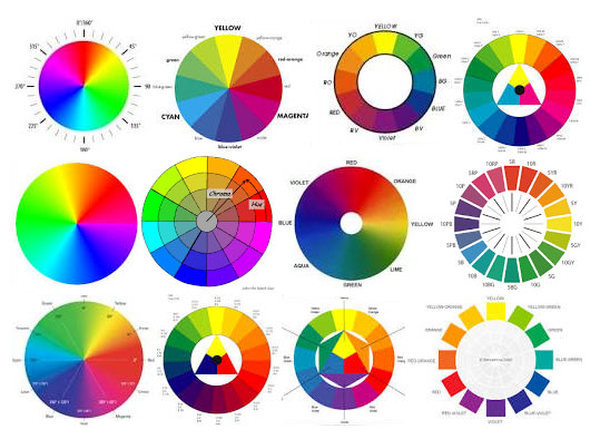
If you care to fiddle around, you may come up with a compilation similar to the one below. However your compilation looks like, it should be clear that there is not a single hue circle. On several Internet pages you'll find instructions how to create color harmonies, say for the design of a web page. Typically, they are based on certain figures in the hue circle: two complementary colors (opponent positions), split complementary (one base color and two adjacent colors on the opposite side), triads (equilateral triangle), and so on.
The strange thing is that no one bothers to explain which hue circle is to be used. Looking at the examples, it's obvious that even simple arrangements like two opponent colors will yield different results depending on the underlying color order.

